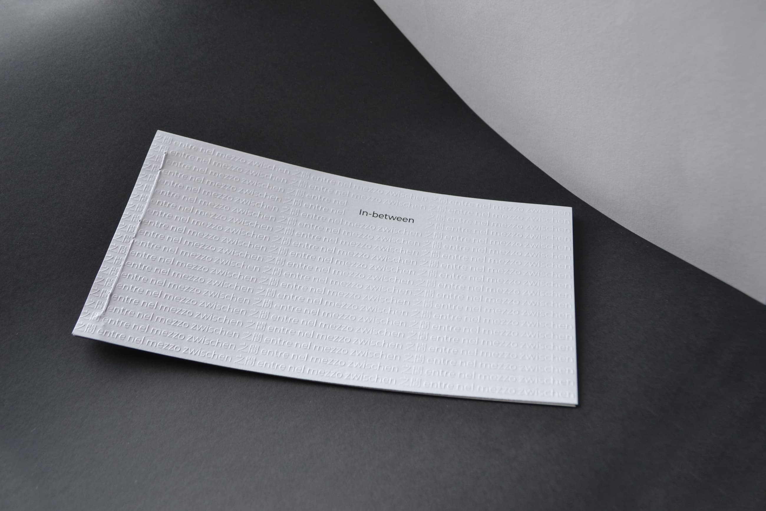
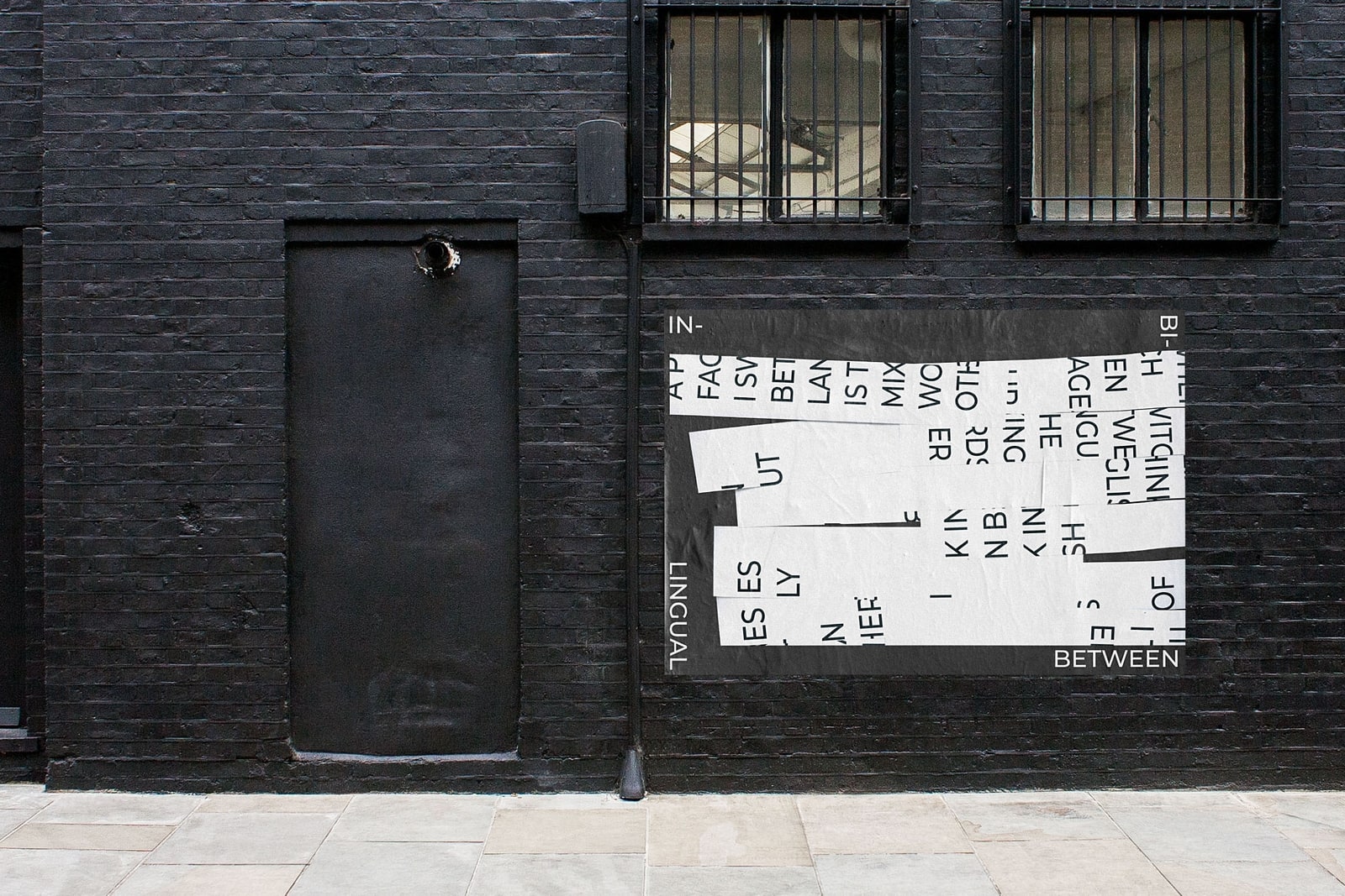
"In Between" was my response to the 2019 Monotype x D&AD brief.
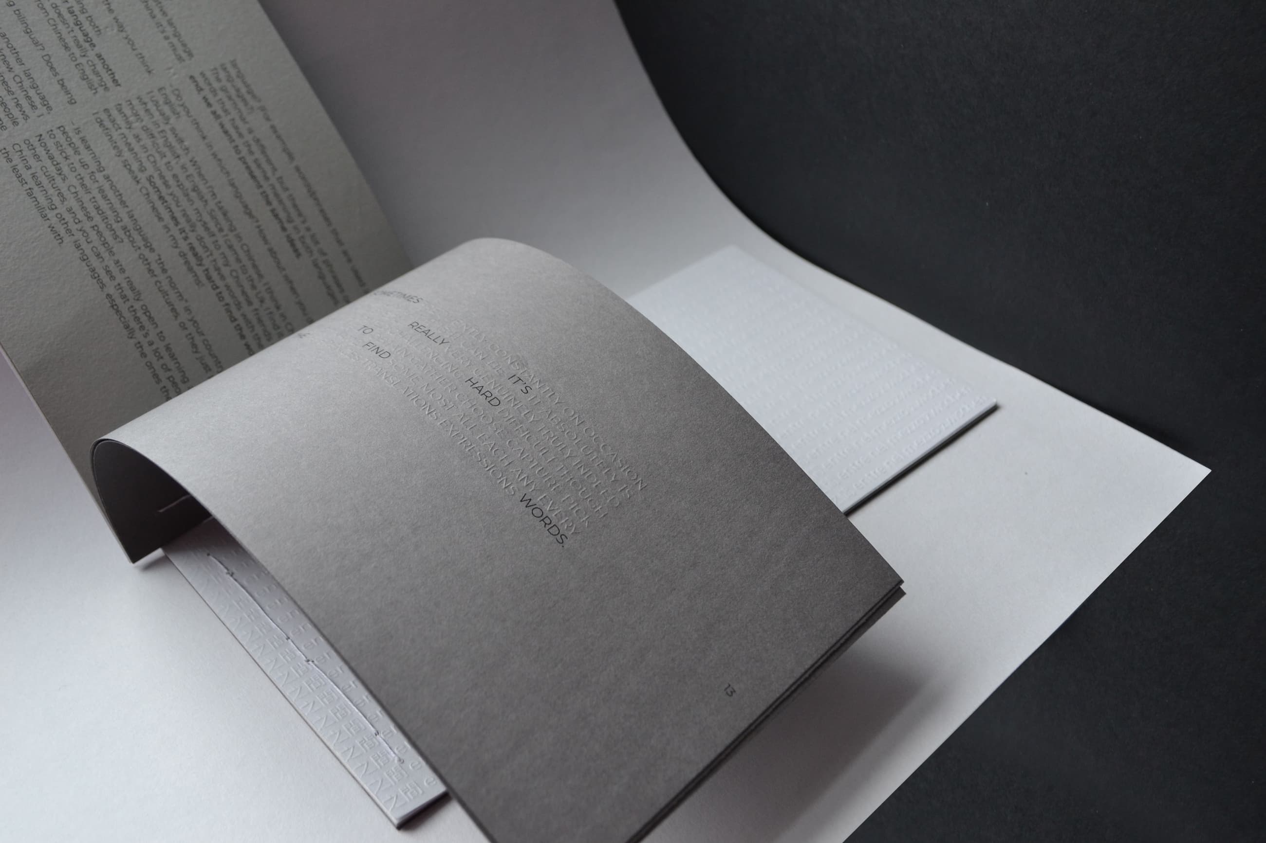
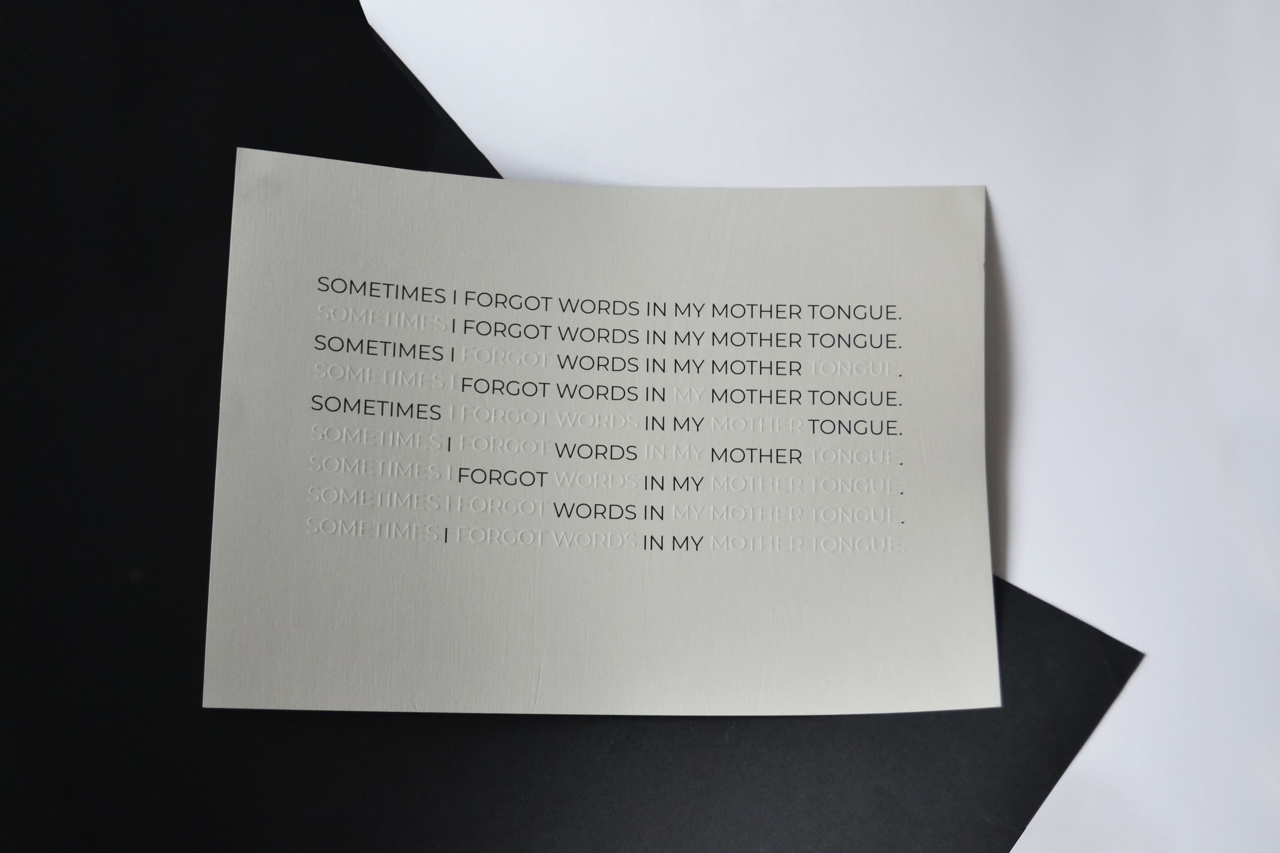
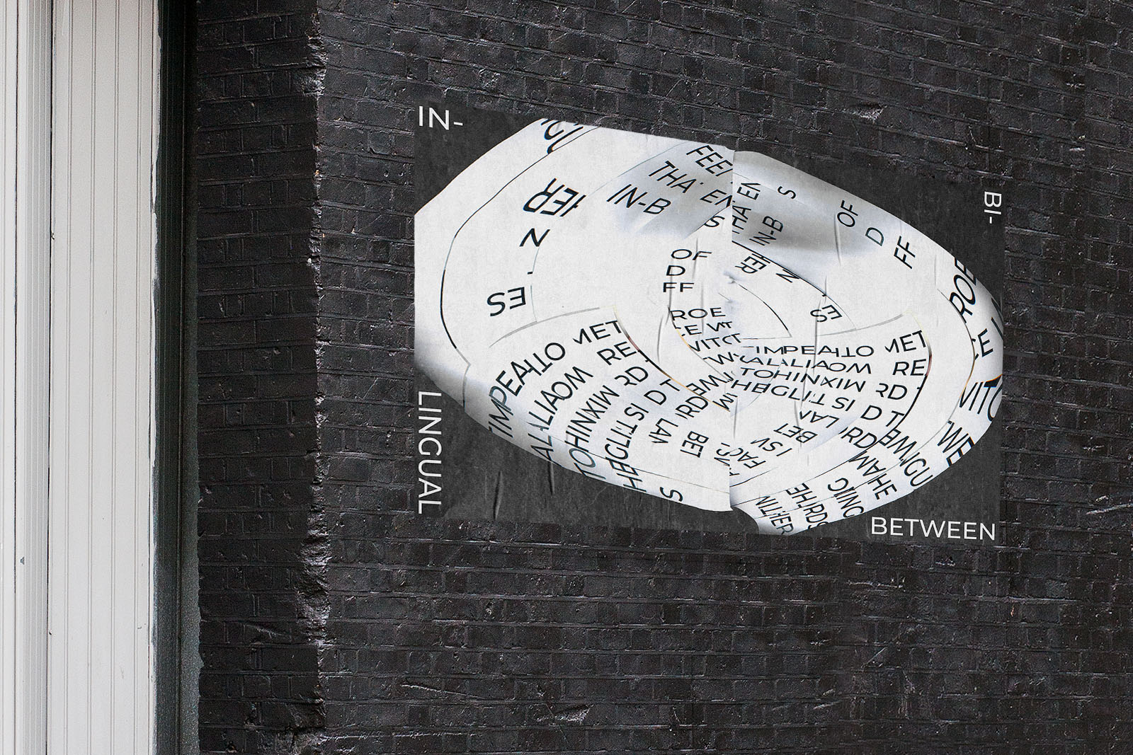
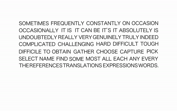
The brief asked to represent a community we felt close to, through language and typography. I decided to talk about the bilingual community and represent visually their everyday struggles through conducting interviews and then animating some key phrases. The animations then turned into more abstract posters and the interviews into a book. The font used is Montserrat, and it is embossed throughout the whole print.
With “In-between” I underline the importance of the bilingual community, as people who, trying to understand each other’s language, make a big step into understanding each other’s culture too.